PTBR
CONFRARIA89
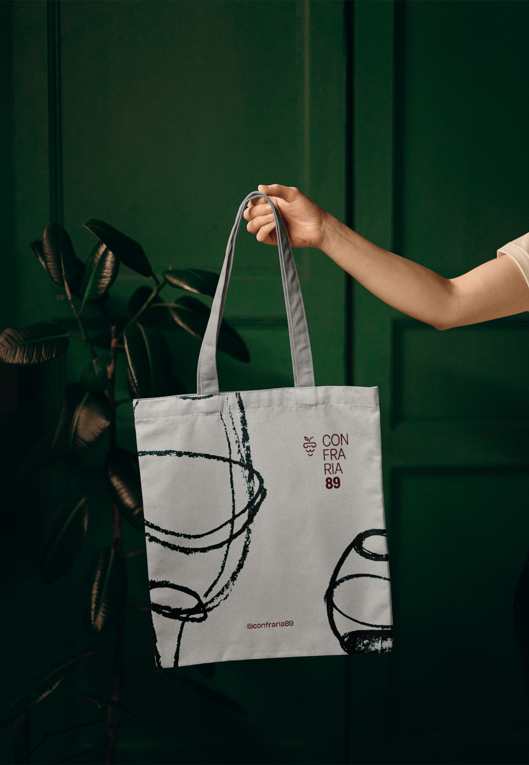
O que acontece quando um grupo de amigos amantes de vinho se reúne para bater um papo? O resultado é um lugar para se propagar conhecimento sobre o universo do vinho e ter conversas profundas sobre filosofia, política, sociologia e sobre a vida em geral.
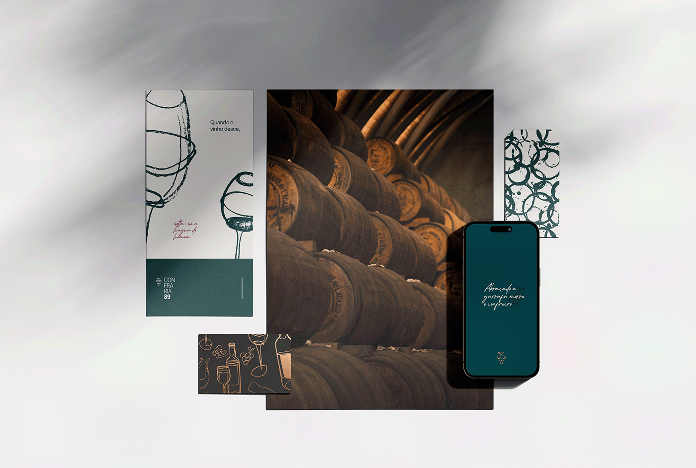
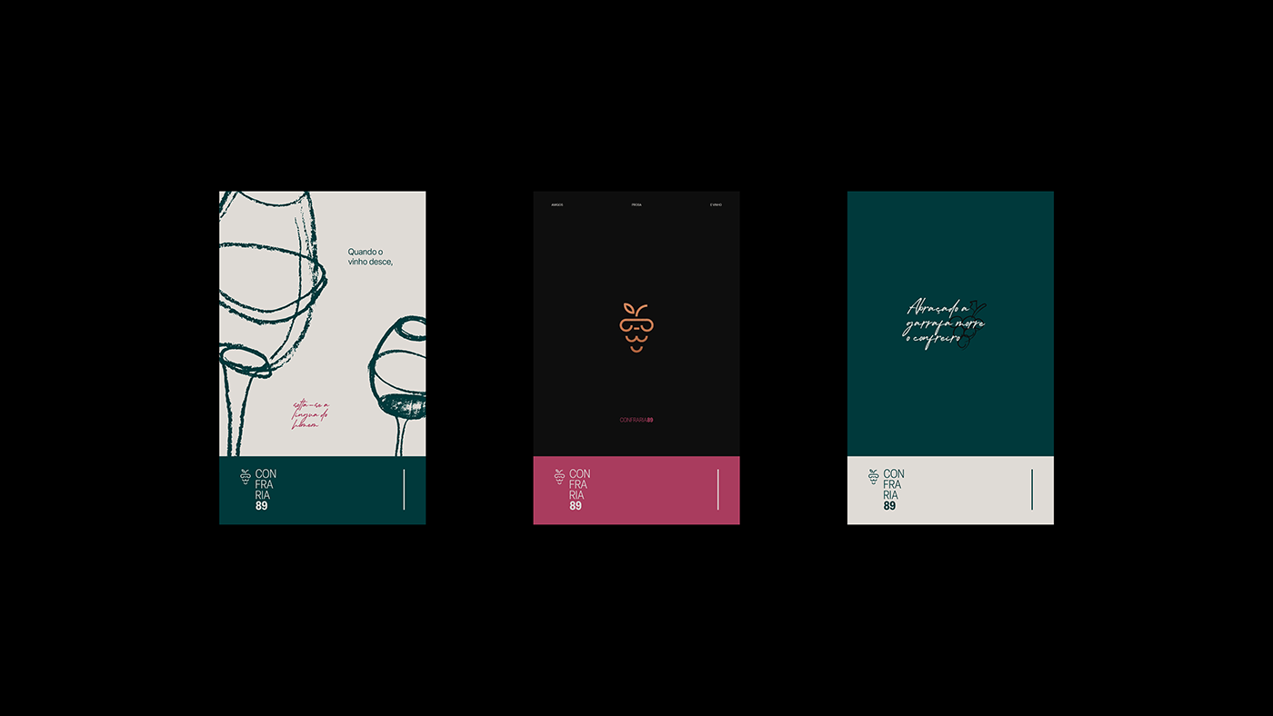
Esse projeto busca refletir os valores e a essência que a confraria possui.
Esse projeto busca refletir os valores e a essência que a confraria possui.
EN
CONFRARIA89
What happens when a group of wine-loving friends get together for a chat? The result is a place to spread knowledge about the universe of wine and have deep conversations about philosophy, politics, sociology, and life in general.
This project seeks to reflect the values and essence that the confraternity possesses.
This project seeks to reflect the values and essence that the confraternity possesses.


PTBR
Cores
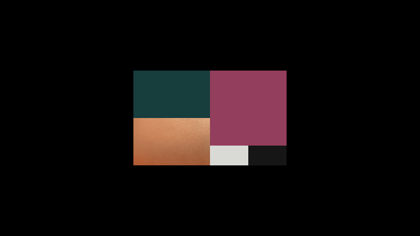
A paleta de cores da marca é moderna, elegante e humana em suas novas cores. O minimalismo e modernidade que a marca busca trazer, é representado pelo cinza “Cool Grey“ e traz leveza e respiro para marca. O preto chumbo traz uma ideia de elegância e exclusividade, o que faz sentido quando pensamos na exclusividade que o próprio grupo tem com a adição de novos membros.
O vinho trazendo a identificação da para o segmento da marca em um tom mais pastel.
O verde musgo trazendo um conceito mais voltado para a origem da marca, que foi a da turma de 89 do exército, por isso foi escolhido o verde para trazer essa alusão. Por último foi selecionada uma textura de bronze para compor a paleta da marca,
trazendo mais elegância e exclusividade.
EN
Colors
The brand's color palette is modern, elegant and human in its new colors. The minimalism and modernity that the brand seeks to bring is represented by the “Cool Grey” and brings lightness and breath to the brand. The black lead brings an idea of exaltation and waiting, which makes sense when thinking about the temptation that the group itself has with the addition of new members.
The wine bringing the brand's identification to the brand segment in a more pastel tone. The green moss brings a concept more focused on the origin of the brand, which was the class of 89 in the army, which is why green was chosen to bring this allusion. Finally, a bronze texture was selected to compose the brand's palette, bringing more ease and ease.